

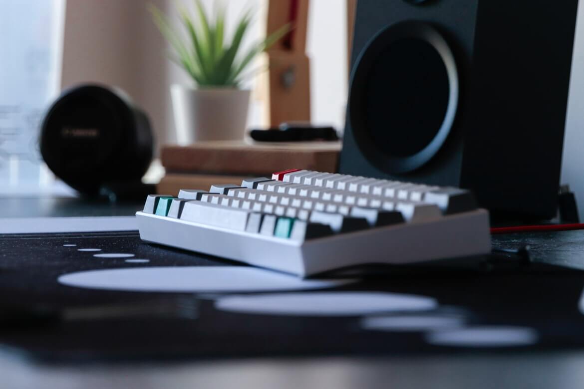
Many people are wondering why a little keycap is so expensive, I think it is the creativity and innovation that make it valuable, after all, each set of keycaps are designed with background and theme by one or more designers who will integrate their ideas into this set of keycaps, so there will be so many classic color schemes.
Many people would like to discuss material, height, feel, and workmanship, but the color of keycaps seems always to be ignored, which is unavoidable because people usually only buy one color for ordinary keycaps. So is it now possible to match those classic colors or DIY keycaps with your creativity? The answer is of course, because many stores launch colorful keycaps for creativity, and there are also dyeing keycaps, so a variety of color choices will not be a problem.
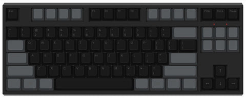
Let me introduce 20 keycap color schemes, some of which are classic colors that are launched before, and some of which I came up with. The above colors are 87-key keyboard collocation, so these colors are only as a reference, specific needs vary from person.
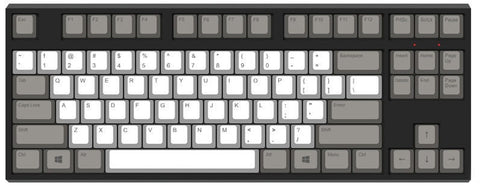
1. Black and White gradient
From black to white, from dark to light, different layers are shown through the gradient of colors. The color schemes of this set of keycaps meet the personality, a natural transition will be very pleasing to the eye, but it is quite difficult to get the right choice of keycap color, it will be easier if you use the dyeing method.
Classic ★★★
Color scheme difficulty ★★★★★
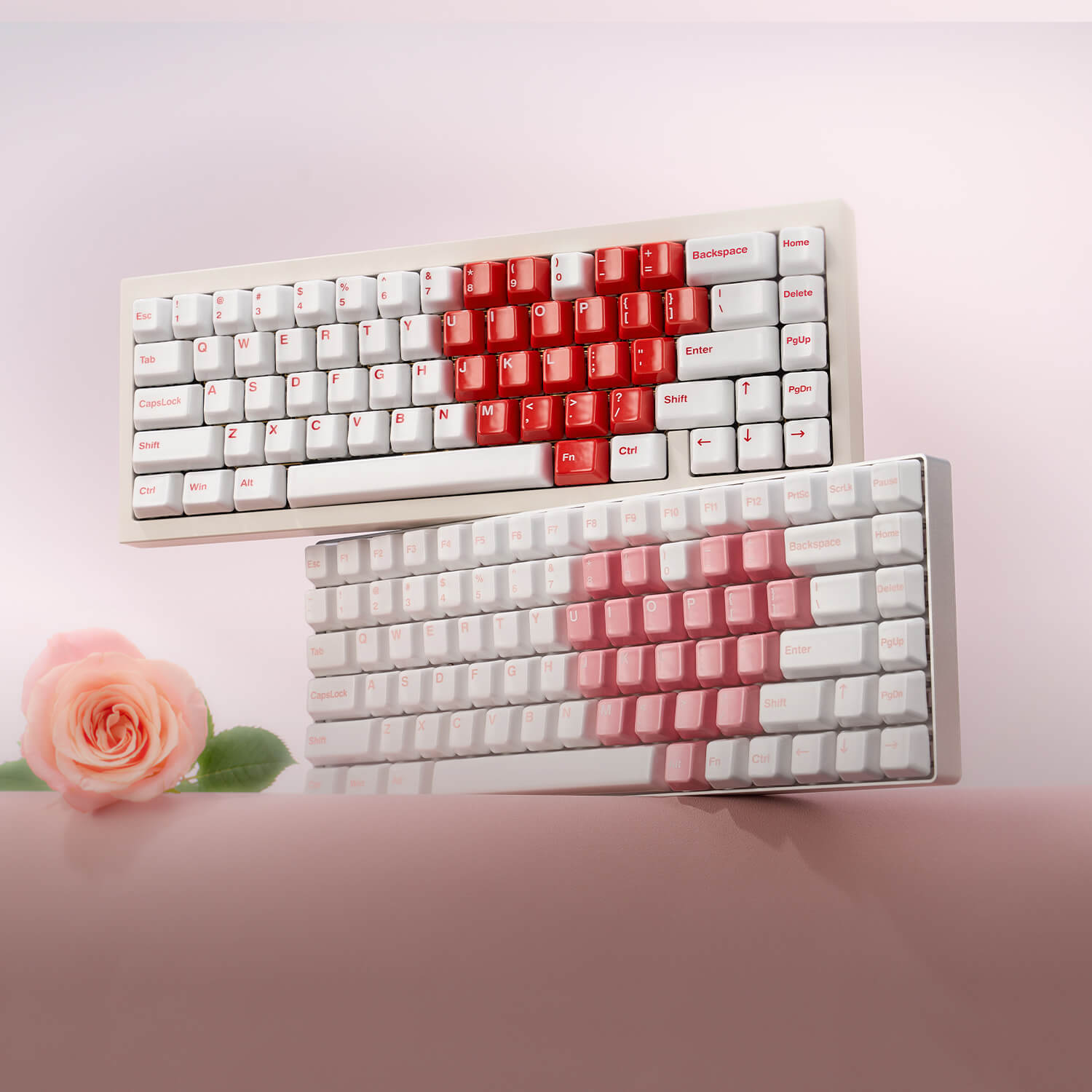
2. Pink Electrocardiogram
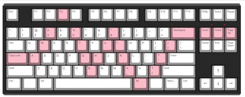
The color scheme consists of a main color-white and a supplementary color-pink, which provides freshness and nature, and the pink keycaps form an electrocardiogram wave in the letter area, representing the heartbeat. the keycaps color schemes will be a favorite of most girls. The color scheme will be very simple with only two common colors.
Classic ★★★
color scheme difficulty ★
3. Purple (Black Widow)

The purple letters represent the skin of the black widow, the Wisteria in the functional area represents the tights she wears, and the crimson ESC represents the trigger of its weapon this color scheme is the official color of ZFrontier that goes well with the Black Widow Concept, I like it very much, while it is difficult to find two contrasting purples.
Classic ★★
color scheme difficulty ★★★★
4. EVANGELION-01-inspired Keycaps
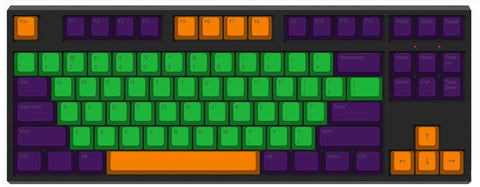
It is a classic model that includes three colors: Purple, Apple Green, and Orange, this color is designed and produced by SP Company, and later the domestic brands also launched the EVA luminous keycaps, and currently, the 2 sets of keycaps have been not for sale again, You can imagine how classic it is! those three colors are not too difficult to find and DIY by yourself.
Classic ★★★★★
color scheme difficulty ★★★★
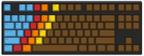
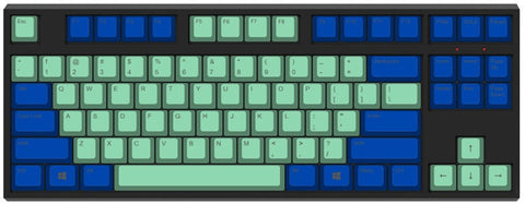
5. Carbon Color Scheme
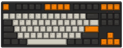
Another classic Carbon model, its color is ivory, black, and orange, tri-color keycaps are designed by T0mb3ry with a SA profile height. In my opinion, its popularity has exceeded the granite model, so that later GMC, the local brand Wuming Eslite have launched their own big ‘Carbon”, and now the domestic manufacturers' large carbon color scheme is blooming everywhere.
It should be noted that the color of its letter area is not pure white which has been ignored by many domestic manufacturers.
Classic ★★★★★
color scheme difficulty ★★★
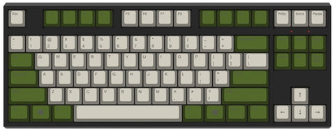
6. Cheese Green
The letter area is white (White), the functional area is grass green, with a white keyboard shell, it looks elegant and vulgar. Of course, this color scheme is quite well-known, which is Fico's most classic cheese green, I feel that it is the best color scheme in Filco limited edition keyboard with the right modification, It is not too difficult to choose a color scheme like, but the grass green needs to be considered twice.
Classic ★★★★★
color scheme difficulty ★★
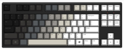
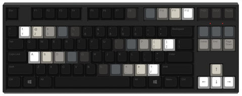
7. Gray and White
The white of the letter area and the steel gray of the functional area are not obtrusive, if the ESC is red, it is the classic Wang Ziru color, I can't verify the reason why this color scheme can be related to Wang Ziru, it provides a nostalgic feeling with the overall color scheme.
Classic ★★★★
color scheme difficulty ★
8. 1976
This color scheme is called 1976, designed and produced by SP Company, and its color blocks use a rare diagonal direction with a bold tone. The combination of Cerulean blue, Permanent red, Lemon yellow, and Burnt umber is diverse but not messy. In terms of DIY color scheme, except for the rare brown, other colors are common.
Classic ★★★★
color scheme difficulty ★★★
9. DND
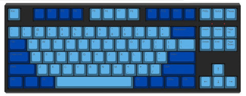
DND is called Dasher & Dancer, also a classic color scheme that is from SP company. It is inspired by the classic Dasher terminal. The letter area is Cyan blue, the functional area is Cobalt blue, and the color gradient transition gives people a deep, silent feeling, of course, its color scheme can also be inverted. Two types of blues are not too difficult to find.
Classic ★★★★
color scheme difficulty ★★
10.Darkness
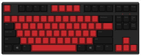
The letter area is Permanent red, the functional area is black, and the colors of the two areas are sharply contrasted with a strong visual impact. The color scheme of this set of keycaps is designed by domestic Pofocaps, which is a set of keycaps with DOTA2 background, making it even more valuable. Red and black are common colors.
Classic ★★★
color scheme difficulty ★★
11. Purple and Pink
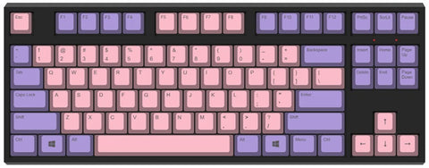
Rose pink in the letter area plus purple in the ribbon make you feel warm, offering a GMC-like iris flavor, but I feel that pink is more in line with purple than blue. Both colors are not too difficult to find.
Classic ★★
color scheme difficulty ★★★
12. Akko Wave Keycaps
It is another black and white keycap that attracts more people with the more prominent gradience in a limited space. The difficulty of the self-color scheme is slightly reduced because the number of change keycaps has been reduced,
Classic ★★
color scheme difficulty ★★★★★
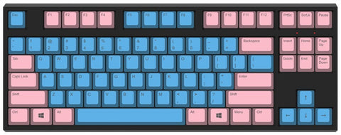
13. Red and Pink
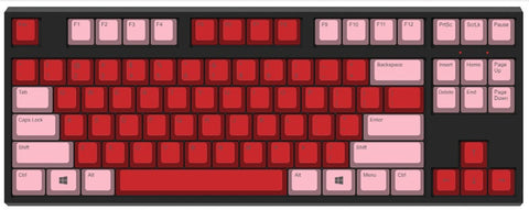
Scarlet letter area plus Pink functional area, the combination of red-pink make the keyboards like a blooming rose, hot and unrestrained, the colors are common.
Classic ★
color scheme difficulty ★★
14. Black and Pink
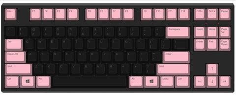
Black letter area plus pink (Pink) functional area, two contrasting colors offer a sullen feeling, personally, it reminds me of a little evil.
Classic ★
color scheme difficulty ★★
15. Dolch
Another classic color is Dolch retro color. black in the letter area plus sky gray in the functional area, or regional inverse color is classic, what is the origin? two colors are used to commemorate the Dolch Pac terminal. in the 1990s, Dolch designed a series of dedicated portable computers, the color of the keyboard is black gray, so SP produced Dolch color keycaps to commemorate the classics.
Classic ★★★★★
color scheme difficulty ★★
16.Blue and Green
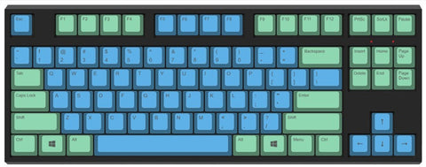
The sky blue of the letter area is matched with the ice green of the upper functional area, a fresh, natural feeling, just like the smoke and rain lanes of GMG.
Classic ★★
color scheme difficulty ★★★★
17. Black and Purple
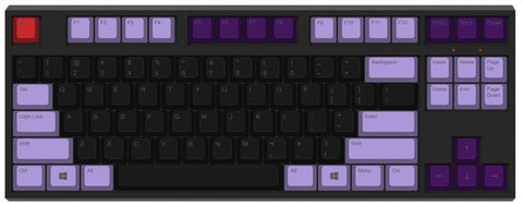
Black and Wisteria color scheme should also be a classic combination, of which purple is made of red and blue, is an excellent attraction color with black to give people a noble and mysterious feeling.
Classic ★★
color scheme difficulty ★★★
18. Miami
Miami's color scheme consists of Cyan blue (Cyan blue) in the letter area with Pink in the functional area, representing the blue sky, white clouds, beach in Miami, its color scheme comes from SP company, the strong contrast of blue powder is unforgettable. Blue exists as the starting point when warm color is the main color, although blue is a fading color, it can also be very eye-catching when the brightness of blue is higher.
Classic ★★★★
color scheme difficulty ★★★
19. Blue and Green
Indigo in the functional area is matched with Cerulean blue in the letter area, the blue is the transition color with azure representing the calm sea, and indigo is the deep sea, from shallow to deep, from near and far, the color scheme presents the vastness, silence, remoteness, and breadth of the sea.
Classic ★★★
color scheme difficulty ★★★★
20. Campfire
The flax color of the alphabet area (Ecru) and the olive green of the functional area highlight the feeling of camouflage uniform, and the keycap is a theme set designed by Ma Lu, which uses a color system that better reflects the military career, the theme is clear just like the military top. These two colors are more difficult to find.
Classic ★★★★
color scheme difficulty ★★★★★
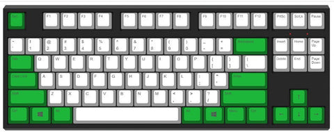
Summary
There are still a few points to pay attention to:
1. Pay attention to the height of the keycaps in the search for keycaps, because it is still very obvious for the height between different specifications of keycaps, be sure to ask whether it is OEM, DSA, original factory in case of unmatched keycaps.
2. the same set of keycaps also has a different height of their keycaps, ask whether it is compatible withR4, R3, R2, or R1, to prevent the problem of inconsistent curvature.
3. the color marked above is to better show its original appearance, if you want to DIY, don’t
the scheme does not need too real color fine classification, the general direction of the right is no problem, of course, this also depends on your own needs and ideas.
4. keycaps color scheme with special names are some classic colors, so there are many manufacturers online to help, you can directly buy the finished product.
Leave a comment
This site is protected by hCaptcha and the hCaptcha Privacy Policy and Terms of Service apply.